Imagine a world without colour – pretty bland, right?
Today we’re diving headfirst into the power of bold colours in art!
Picture this: without colour, our art would be as exciting as watching paint dry (literally!). But when we dive into those bold colours – think striking reds, electric blues, and sunshine yellows – that’s when the magic happens. They’re like the secret sauce that turns a plain old painting into a masterpiece that grabs your attention and won’t let go.
So, if you’re ready to take your art game to the next level, embracing those bold colours is the way to go. Trust me, your work will thank you for it!
The Power of Bold Colours:
You know how certain colours just hit you in the feels? Well, that’s not by accident!
Colours have this crazy ability to mess with our emotions and perceptions without us even realising it.
This is particularly true with bold colours – these bad boys are like emotional powerhouses!
Red is all about passion and energy – think love, anger, or even hunger (ever noticed all those fast-food joints rocking the red decor?).
Then you’ve got blue, the OG of calming vibes. It’s like a deep breath of fresh air, instantly soothing and serene.
But here’s where it gets really interesting. Bold colours don’t just mess with our emotions; they also make our eyes do a happy dance 🙂
Picture this: you’re strolling through an art gallery, and bam! Your eyes lock onto this insanely vibrant painting that practically jumps off the wall. That’s the power of bold colours! They grab your attention and refuse to let go, creating this intense visual feast that keeps you coming back for more.
Using bold colours is a timeless tradition in art
Let’s talk about some art legends who weren’t afraid to turn up the colour dial to max:
Vincent van Gogh:
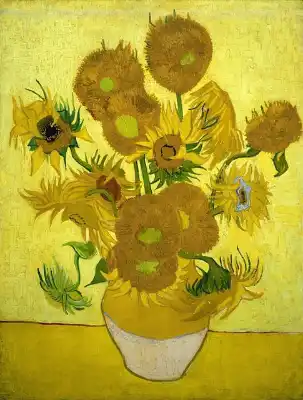
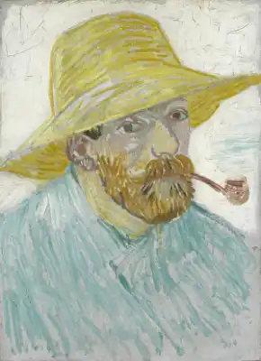
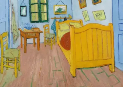
This guy practically wrote the book on bold colours. From his iconic sunflowers to those mesmerising starry nights, van Gogh wasn’t shy about slapping on the paint. His use of vivid yellows, deep blues, and fiery oranges not only captured the essence of his subjects but also conveyed his own turbulent emotions.
Henri Matisse:
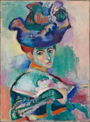
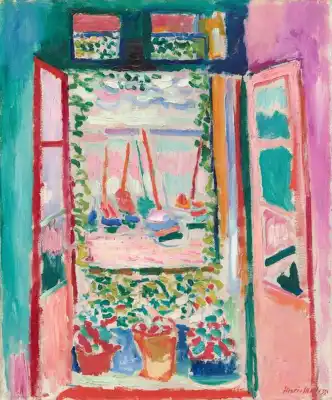
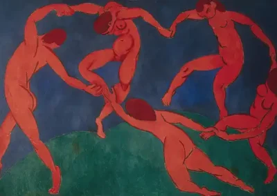
Matisse was like the OG of bold colours. He basically looked at a rainbow and said, “Hold my palette.” His paintings are like a riot of colour – vibrant, lively, and impossible to ignore. Just check out his famous work “The Dance” or “Woman with a Hat” and you’ll see what I mean.
Frida Kahlo:
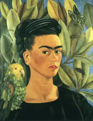
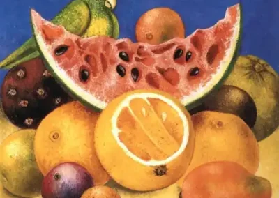
You can’t talk about bold colours without mentioning Frida. Her self-portraits are like a kaleidoscope of emotions, with every colour telling a different part of her story. Whether it’s the fiery reds symbolizing passion or the deep blues representing her pain, Frida’s use of bold colours was as fearless as she was.
Mark Rothko:
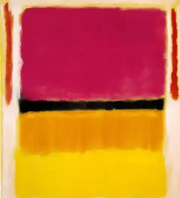
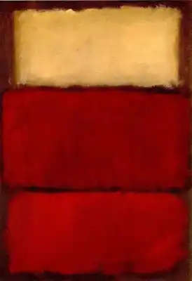
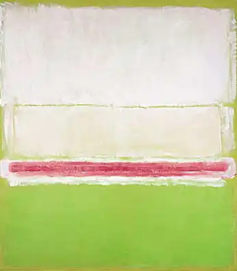
Rothko was all about the color field movement, which basically means he took huge swaths of color and slapped them onto canvas. But there was nothing random about it – every color choice was deliberate and packed with meaning. His paintings, like “Orange and Yellow” or “No. 61 (Rust and Blue),” are like these giant portals of color that draw you in and make you feel things you didn’t even know you could feel.
And then there’s me!!! And hopefully you too LOL
These artists weren’t just painting pretty pictures – they were using bold colours to make a statement, shake things up, and maybe even change the world a little bit.
And if that’s not art goals, I don’t know what is!! 😉
Next time you’re whipping out your paintbrushes, don’t be afraid to go bold. Not only will you be tapping into a whole rainbow of emotions, but you’ll also be creating art that demands to be seen. And trust me, the world could always use a little more colour!
In my next blog post, I’ll talk a little about breaking the rules of colour and share some tips to master bold colour mixing,
x mimi bondi
PS: Blog posts take a lot of work to create – your feedback and comments are truly what makes the hard work worthwhile 🙂




You’re so right about Van Gogh! His use of colour matching his emotions, and Frida Kahlo seems to be fearless full stop! I’ll try going bold! I look forward to your next blog post!
So happy to hear that Cheryl!! I’m currently watching the movie Frida to learn more about her 🙂
Love this! Not too long, easy and fun to read and great pics to help explain. I’m in Sydney and really don’t know how I stumbled onto your site or exactly when but…I’ll be hanging around now to receive more of these cheerful and creative Blogs. Julie
I really appreciate your feedback Julie! I love it when we find each other out of the blue in such a big world!! I was in Sydney most of my life here but in QLD now – not that far considering how big this planet is 😉
I have loved reading about your travelling and while I am disappointed the online store is permanently closed I am glad I get to learn more about color etc in your blog posts 🙂
Thank you so much for your lovely comment Karen! Ahhh. I am sad too about the Store… Who knows what I may come up with in the future though 😉 So happy you enjoyed this first post xx mimi